 Population
vs. Area
Population
vs. Area
Population
vs. Area
Population
vs. AreaWhen reviewing dot density maps, it is important to remember that the dots are scattered over a certain area. Although this does lead to a good representation of data, it may lead to some misconceptions. Take for example the map below.
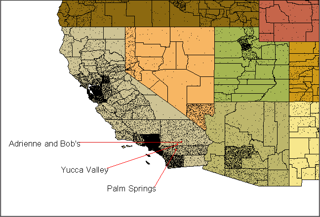
Population map of California One Dot = 2000 People
Looking at the map, it seems that the San Bernardino County, which is home to my Aunt Adrienne and Uncle Bob is well populated. According to the above map, Adrienne and Bob's home appears to be in a fairly populated area. Actually, they live in a spatial populated area in which the closest city is Yucca Valley and Landers Base. The area just looks to be populated on the map because of the size of the county. Dot density maps scatter the dots according to a certain range. The above map is based upon population according to county. Thus, GIS scatters the dots accordingly throughout the county.
A better representation of San Bernardino County population is seen in the map below. This maps is based upon population per square mile.
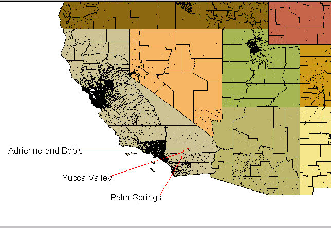
California Population per square mile
On this map, San Bernardino looks spatially populated, which is true. Although GIS still scatters the dots randomly over the area, this population map per square mile is a much better representation.
When reviewing dot density maps over great distances, it is important to keep in mind the random scattering. For large areas, like San Bernardino County, the dot density scattering might cause harm, instead of being an analyzing resource.
Home
GIS
Main Next